Hanging artwork in your home can instantly lift a room’s style, but getting the height just right is key. You don’t want your beautiful new painting perched awkwardly over the couch or floating out of view. As a general rule, keep the center of the artwork around 57–60 inches from the floor. That puts it roughly at eye level for most people, so guests can enjoy your art comfortably. In practice, this “eye-level rule” means adjusting for furniture and room height. For example, if you have an 8–9 ft ceiling, sticking close to 57″ is good, while a very tall 10 ft or higher ceiling might allow the center to creep up to about 62″ for balance.
- General Guideline: Aim for the center of each painting at about 57–60 inches from the floor. This gives a comfortable viewing experience and is a common standard in home decor.
- Above Furniture: If you hang art over a sofa, bed, or console table, leave about 6–12 inches between the top of the furniture and the bottom of the frame. Too large a gap can disconnect the art from the room, while too little might make it look crowded.
- High Ceilings: In rooms with tall ceilings, you can raise the art a bit higher. For example, with 9-foot ceilings aim around 60″, and with 10+ foot ceilings, you could go up to about 62″. Use your eyes – the goal is still a natural feel, not leaving miles of empty wall below.
These quick pointers will get you started, but context matters. In a living or family room where you mostly sit, it often looks better to hang art slightly lower so it’s easily seen from a chair. One design expert even suggests having someone hold the painting in place while you sit back and check how it looks. In contrast, in a hallway or standing area, you might stick closer to the 57–60″ center rule. The main mistake to avoid is hanging art too high. Many of us tend to put pictures almost at ceiling height, but this can make them hard to appreciate. “Most people hang their wall art WAY TOO HIGH,” warns one design blog. By following the numbers above and considering furniture and ceiling height, you’ll get much better results.
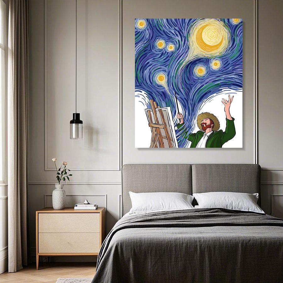
Above Furniture: Living Room and Bedroom
The furniture in a room acts like a natural anchor for art. When you place a painting above a sofa, chair, dresser, or bed, it should feel connected to that piece. Here’s an easy check: the bottom of the frame should usually be 6–12 inches above the top of the furniture. For example, if your sofa back is 30 inches high, hang the bottom of your picture about 36–42 inches from the floor. This keeps the art within your peripheral vision when you’re seated and creates a cohesive grouping. Hanging much higher makes the art float alone and the wall looks bare.
Another common setting is above a console table or sideboard. The same “6–12 inch” rule applies. As an alternative, some people use the “2/3 rule” – making the width of the art grouping about two-thirds the width of the furniture below. But height-wise, stick to that comfortable gap. In a bedroom, an oil painting above the headboard should also sit low enough to feel snug above the bed (often around 4–8 inches over the frame). If you try hanging artwork over furniture at eye level, it can actually look too high. For instance, if you flipped by 5–6 more inches, it might start to feel disjointed.
Different Oil Painting Styles and Placement
The style and texture of your oil painting can affect how you display it. Here are some quick tips for specific types:
- Textured Oil Paintings: These artworks have thick paint layers or reliefs. They cast shadows and depend on good lighting. To highlight the texture, try hanging the piece where natural or spotlighting will hit it at an angle. Keep it at standard eye level, but maybe a tad lower if the texture is heavy (so viewers get a straight-on look at the ridges). Make sure it’s not too close to a bright lamp that could glare off the paint.
- Wabi-Sabi Paintings: Wabi-sabi art is all about natural simplicity and imperfection. These often work well at a slightly lower height (but still around normal eye level). Hanging a wabi-sabi piece a little below center can create a calm, grounded feeling – as if it’s inviting you in. It pairs beautifully above natural wood furniture or in a bedroom. Just avoid extreme asymmetry; even though wabi-sabi embraces imperfection, you still want the artwork to be comfortably viewable.
- Colorful Oil Paintings: Bright, vibrant art instantly draws the eye. To make it pop, keep the painting near standard eye height (57–60″) and on a neutral wall, so colors shine. If your colorful piece is large, treat it like a focal point: center it, give it space, and use that 6–12” furniture gap if needed. In a gallery wall of mixed art, put the vivid one at center for balance. One tip: avoid hanging a very colorful painting in a dim corner – it’s worth positioning it where light can reveal its full palette.
- Abstract Oil Paintings: Abstract pieces can play by their own rules. Many abstracts are bold statement pieces, so they often look best centered at eye level too. If the abstract is tall and narrow, you might align its top third at eye line for the best composition. For groupings, make the whole collage’s center around 57–60 inches, and keep even spacing (around 2–5 inches between frames) so it feels intentional. Play with symmetry vs. salon style layouts – but keep each individual abstract comfortable to look at.
No matter the style, avoid hanging a single small painting way up on a big blank wall with lots of empty space. Small works look better grouped or at least with some other decor nearby. This not only follows scale but also keeps them at a natural height cluster.
Common Mistakes to Avoid
- Hanging Too High: We’ve all seen it – a gorgeous painting way up near the ceiling. This is a common design oops. Even tall folks shouldn’t have to tilt their heads to see art. As noted earlier, aim for that 57–60″ center height. If a piece feels too high, simply pull it down a few inches – you’ll be amazed how much better it looks.
- Ignoring Furniture Proportions: If your painting is much narrower than the sofa or console below, it can look lost. On the flip side, don’t use an art piece wider than the furniture. A good rule is that the art width should be no more than about two-thirds to three-quarters of the furniture width. Vertically, remember the 6–12 inch gap rule. Keeping these proportions avoids an awkward “floating” look.
- Uneven Groupings: When hanging multiple pictures together (a gallery wall), avoid uneven spacing or crazy tilt. Keep each frame level and leave about 2–5 inches between them. Unbalanced gaps are distracting. Also, try to have the center of the whole group at around 57″ as if it were one big piece.
- Poor Lighting and Glare: Placement height affects lighting, too. Don’t hang precious art directly under a light that casts glare on its surface. For textured paintings, use softer or angled light so the brushstrokes can cast gentle shadows (which enhances their look). And avoid hanging in direct sun – UV rays can fade colors over time.
Quick Tips for Perfect Placement
- Measure twice, hang once: Use a tape measure and mark the wall with a pencil dot at 57–60″ for the center of your piece. It’s much easier than estimating by eye.
- Paper template trick: Cut a piece of butcher paper to the art’s frame size and tape it on the wall. Step back and move it around to find the spot you love before hammering any nails.
- Mind the Hardware: Heavy oil paintings need strong hangers or anchors. Make sure hooks or screws are rated for the weight. In homes, just like in galleries, two points of contact is safest so the art won’t tilt over time.
- Check from a Distance: After hanging, view the art from across the room or while sitting down. How does the height feel? If it still looks high or low, adjust it.
- Trust Your Eyes: Rules are guides, not rigid laws. Sometimes an off-center height looks better given a doorway or furniture nearby. Ultimately, if it feels right to you and isn’t neck-craning, you’ve found the perfect height!
By combining these guidelines and tips, you’ll create balanced, gallery-like displays in your home. A painting at the right height really connects the room, whereas a mis-hung piece can leave everything feeling “off.” With a bit of measuring and these simple rules, your art will look at-home – literally.