Is Your Flower Painting Looking Flat? Here’s How to Add Some Spark
So you finally finished your flower painting, stepped back, and… something’s off. The colors feel dull. The petals seem stiff. The whole thing just doesn’t pop.
Don’t worry — it happens to every oil painter at some point. The good news? You can totally fix a flat flower painting without starting over. Let’s dive into the common causes and simple solutions.
1. Reassess Your Lighting – It Might Be the Culprit
Light brings life to a painting. If all your flowers are the same value (aka brightness), they’ll look 2D.
Try this: Add a strong light source in your mind — top left or top right usually works well. Then adjust highlights and shadows accordingly. Use lighter hues (like white mixed with yellow) for the sunlit side, and deeper tones (like ultramarine or burnt umber) in the shadows.
It’s kinda magical what a few well-placed highlights can do.
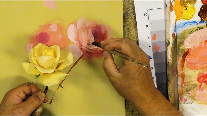
2. Pump Up the Contrast (But Not Too Much)
Flatness often comes from too many middle tones. Your flower needs contrast — dark against light, soft against textured.
Here’s what to do: Deepen the background or the foliage around the flowers. Make your shadows richer. Then come in with a palette knife or thick brush for highlight areas. That difference in texture and color value brings the painting to life.
3. Create More Depth With Overlapping Shapes
If your flower petals are all spread out like a perfect daisy, the painting might look too “flat-on.”
Instead: Overlap some blooms. Show one flower behind another. Add a few petals curling over others. These layers create visual depth and draw the viewer in.
It’s like turning a photograph into a movie scene — suddenly there’s dimension.
4. Work on the Edges – Soft and Hard Matter
Not all edges should be crisp. When every petal has a clear outline, the painting lacks atmosphere.
Try softening: Use a dry brush or your finger to blur some petal edges, especially those in the background. Then keep the front petals sharp. That edge contrast helps build focus and perspective.
5. Adjust Color Temperature
Too much of the same color temperature (all warm or all cool) can flatten your scene.
Quick fix: Use warmer tones where the light hits (think yellows, peach, rose) and cooler shades in the shadow (like blue-lavender or green). This subtle shift adds vibrancy and depth without changing your whole palette.
6. Don’t Overwork It – Let It Breathe
Sometimes, flatness comes from over-blending. Everything turns muddy, and brushstrokes disappear.
Solution: Add fresh strokes on top. Use thicker paint with visible texture. Let the brush marks stay. That painterly quality makes the flower come alive again.
Final Thoughts: Bring Back the Bloom
Flat flower paintings aren’t failures — they’re just a step in your journey. With a few tweaks in contrast, lighting, texture, and composition, your artwork can go from lifeless to lively.
And the best part? You’ll start to recognize what went wrong — and avoid it next time.
Keep painting. Keep fixing. And most of all, keep enjoying the process.