Introduction: Backgrounds Matter More Than You Think
When we paint flowers, most of us focus on petals, colors, and brushstrokes. But hey — what’s behind the flower can make or break the whole painting. A well-chosen background color doesn’t just sit there. It helps your flowers pop, adds mood, and ties everything together.
So, if you’re wondering what color to put behind that daisy or tulip, you’re in the right place.
1. White Backgrounds: Clean, Crisp, and Beginner-Friendly
Let’s start simple. A white background is like a blank page for your blooms. It makes bright colors shine and is great for painters who love a minimalist style. Especially if your flowers have soft pastels or vibrant tones, white helps them stand out without distraction.
But be careful — too much white with pale flowers can make things feel a bit washed out.
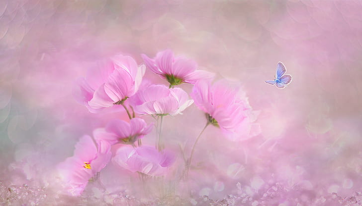
2. Soft Beige or Warm Greys: Subtle Elegance
If white feels too stark, try a light beige or a warm grey. These background shades are gentle and add warmth without stealing attention. They work beautifully with yellow, pink, or lavender flowers.
They also make your painting feel a little more “finished” and cozy. Some painters like to mix a tiny bit of burnt umber into their white to get that gentle tone.
3. Bold and Dark: Deep Blues, Forest Greens, Even Black
Wanna go dramatic? A dark background can make your flowers explode with color. Think about deep navy, dark green, or even black. These create contrast and intensity, especially with red, orange, or white petals.
But use with care — it’s easy to overdo it. Sometimes too dark can overpower the softness of your flowers.
4. Complementary Color Magic
Here’s a fun trick: use the opposite color on the color wheel. Painting purple flowers? A soft yellow background will make them shine. Got red roses? Try a hint of greenish grey behind them.
Complementary backgrounds give your piece a natural contrast that feels balanced and exciting.
5. Gradients for Depth and Movement
Backgrounds don’t have to be flat! A soft gradient — say, from pale blue to white — can give your painting extra dimension. This works especially well when you’re painting a bouquet or multiple flowers.
Just make sure your gradient is smooth. Uneven blending can look distracting unless you’re going for a more abstract look (which is cool too).
6. A Note on Texture and Brushwork
Sometimes it’s not just about color, but how you apply it. A lightly textured background — maybe dry-brushed or with palette knife strokes — can add energy to your piece. It’s also a sneaky way to hide mistakes (we all make ‘em!).
Try experimenting with background first, then paint the flower over it once it dries.
Final Thoughts: Trust Your Gut and Play Around
At the end of the day, there’s no “best” background color for flower paintings — just what works best for your style and the feeling you wanna create. Don’t be afraid to test a few options on scrap canvas. Sometimes the most unexpected choice turns out the most beautiful.
Just remember: background isn’t “extra.” It’s part of the art.