Introduction: It’s Not Just Flowers—It’s a Whole World
When you paint flowers in oil, you’re not just slapping petals on a canvas. You’re trying to build a little world — one with space, shape, and glowing light. But don’t worry, you don’t need to be a master to do that. There are a few super-easy tricks to give your floral paintings more depth and life, even if you’re still new to oil.
Let’s break it down step by step.
1. Use Dark to Push, Light to Pull
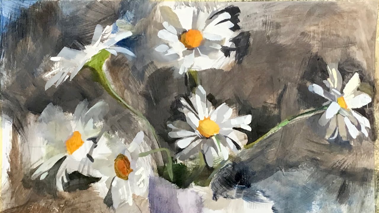
One classic rule: dark colors recede, and light colors come forward. That means if you want your main flower to pop, make the background slightly darker behind it.
Here’s a trick: after blocking in your flower shapes, go back and deepen the shadows between petals. Just a bit of burnt umber or ultramarine blue in the crevices can make the flower suddenly feel 3D.
2. Work in Layers (Even If You’re Impatient)
Oil paint is forgiving, but it needs a little patience. Start with your mid-tones, then add shadows and highlights later. This layering effect creates dimension — it’s like sculpting with paint.
A quick cheat: Use a palette knife for a few bold highlight strokes on top once the underpainting is dry. Instant texture, instant depth.
3. Don’t Just Use White for Highlights
Here’s where many beginners go wrong — they add pure white for shine. But white can look flat or chalky. Try mixing titanium white with a hint of yellow or pink for warmer highlights, or a little blue for cooler spots.
It makes the flower look like it’s glowing, not painted.
4. Cast Shadows Make It Real
If your flower is floating in space with no shadows, it’ll feel fake. Add soft, cool-toned shadows where petals overlap or fall onto leaves or the table.
Use a slightly thinner brush and mix a tiny bit of purple or cool grey into your base color. Blend it out softly. Boom — now your flower lives in the real world.
5. Contrast Is Your Secret Weapon
High contrast is what makes things “pop.” So don’t be afraid of deep darks and bright brights. If your flower is pale, make sure something nearby is rich and dark. It creates balance and tension — and that tension is what pulls the eye in.
Think of a pink rose on a dark green stem. That combo never fails.
6. Light Direction = Drama
Pick a direction for your light source — top left, bottom right, wherever. Then stay consistent. Shade the opposite side of every petal. When your light logic holds up, even the messiest flower starts to make visual sense.
Tip: lightly sketch in arrows on your canvas to remind yourself where the light’s hitting from.
7. Glazing for a Soft Glow
Glazing is just adding a thin layer of transparent color over dry paint. Use linseed oil or a glazing medium. A soft yellow glaze over white petals adds warmth. A gentle blue glaze behind pink flowers cools the whole piece down.
Try it. It’s like giving your flower painting a dreamy Instagram filter.
Final Thought: Just Keep Playing
Honestly, there’s no perfect formula for depth and light. Sometimes you’ll nail it, sometimes you’ll mess up. But that’s how you learn.
The more you play with shadows, contrast, and layers, the more natural it’ll become. So don’t stress — just keep painting, keep experimenting, and your flower paintings will start to bloom in ways you never imagined.